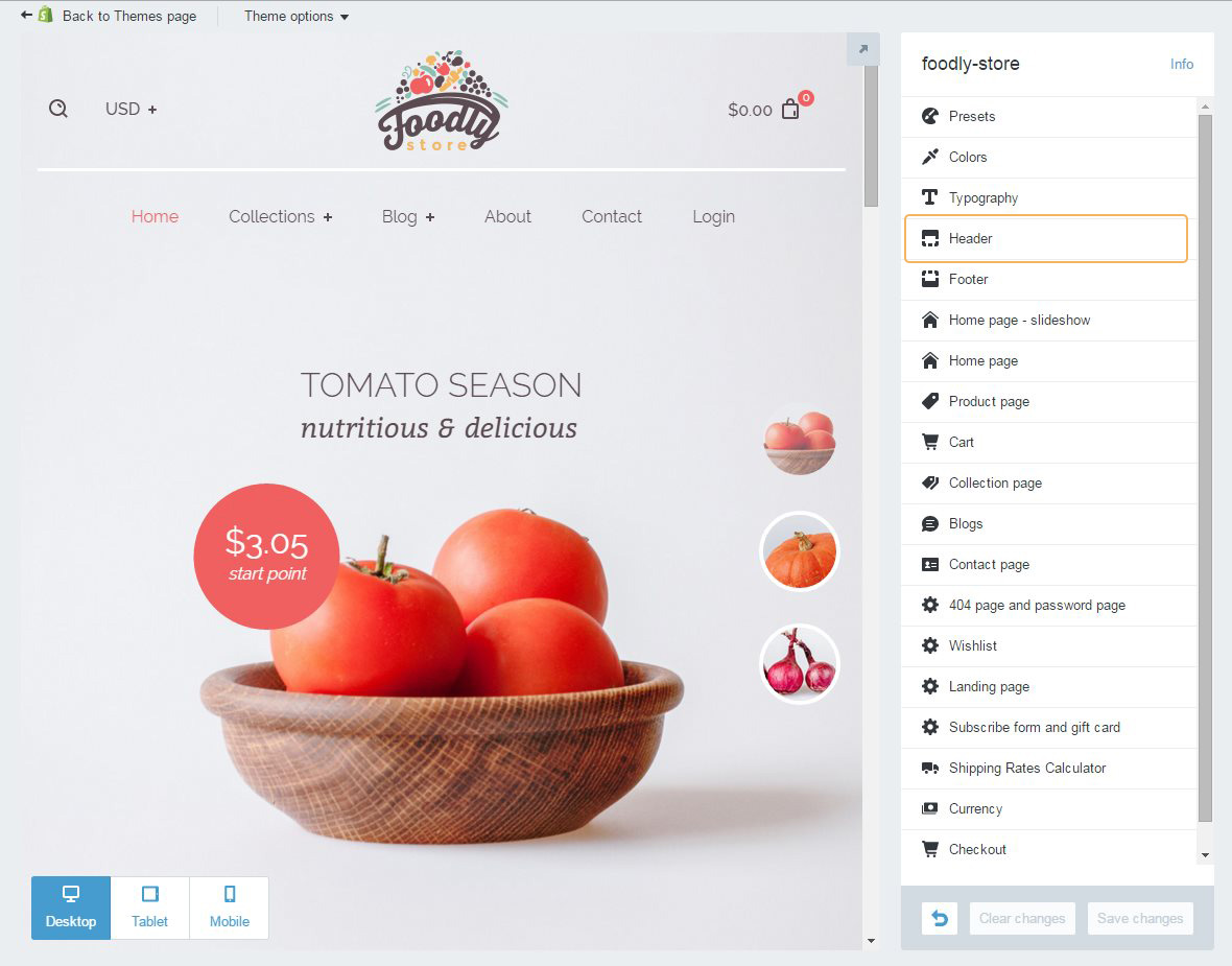
Header
Header - part of a site with a main menu, logo, cart, search and currency. It is global all over the site. It should contain information that can be needed as help guide in navigating the store. Foodly header can be adjusted in special settings section 'Header'. Here's what you can change:
-
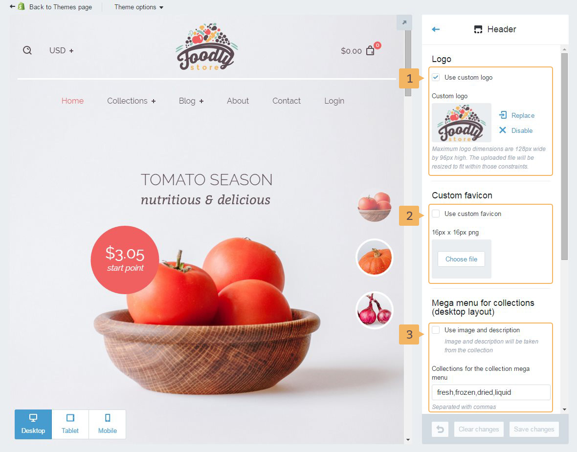
Logo (Fig. 5.2 - [ 1 ]).
Notice! Image for logo must be maximum 128px by 96px. If the image isn't specified, instead of the logo will be used store name.
-
'Custom favicon' (Fig. 5.2 - [ 2 ]). It is an icon of website or webpage. Browsers that provide favicon support typically display a page's favicon in the browser's address bar (sometimes in the history as well) and next to the page's name in a list of bookmarks. Browsers that support a tabbed document interface typically show a page's favicon next to the page's title on the tab, and site-specific browsers use the favicon as a desktop icon. We highly recommend adding favicon to your store. This tiny image can enhance your brand presence online and stick in user's mind.
-
'Mega menu for collections' (Fig. 5.2 - [ 3 ]). This navigation element we have put into separate section. Please, read Visually Enriched Mega Menu (Dropdown) chapter of this paper.
-
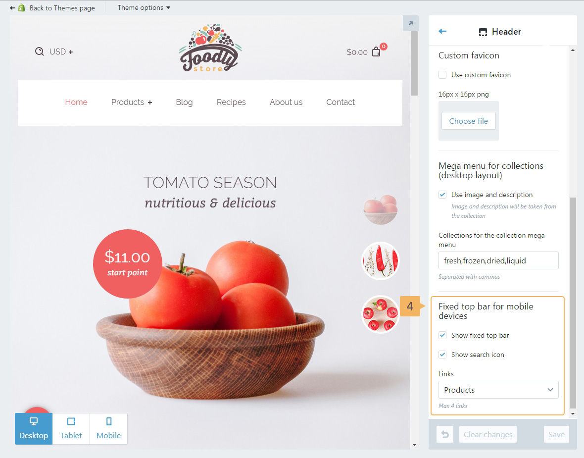
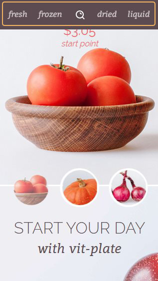
'Fixed top bar for mobile devices' (Fig. 5.3 - [ 4 ]). It is specially crafted navigation for mobile devices to enhance user experience on smaller screens. When space is an issue and scroll can be infinite it might be hard to get back to the main naviagtion. So we granted Foodly theme with a nifty solution that looks like this Figure 5.4 that helps browse main product collections swiftly.